Penny's apartment from The Big Bang Theory, redesigned: the short island is the weak point
The short answer: The furniture in 4B is fine, the island is the mistake. It is too short to prep on, too short to eat at, and it splits the room without paying rent. Stretch it, put the hob in it, hang two stools off the end, and one piece of furniture covers prep, eating and casual seating in a flat with no room for a real dining area.
Penny’s apartment is the smaller half of the most looked at hallway in sitcom history, and it is the more interesting half. Sheldon and Leonard have space. Penny has a small angular one bedroom where a single room has to be the kitchen, the dining room and the living room at the same time. That is the version most people actually live in.
One thing to say plainly before anything else. Sitcom sets have inconsistent geometry, and there is no official floor plan of 4B. Walls shift between seasons, the fourth wall does not exist, and every plan online is a fan reconstruction. So this is a reading of a fan known layout, not a survey. The fixes hold anyway, because the problem is generic: one wedge shaped room, three jobs, no spare meters. Same exercise we ran on the HIMYM teardown.
What the apartment already gets right
More than people give it credit for.
The sleeping half is properly separated. A diagonal wall cuts the plan in two: bathroom and bedroom on one side, everything else on the other. In a flat this size that is a genuine luxury. Feng shui’s big complaint about studios is that yin (sleep) and yang (cooking, working, socializing) share one volume, so rest never fully rests. Penny has a wall. Most people in her rent bracket do not. We go through the versions where you do not, in the small apartment guide.
The kitchen faces the room. The hob sits in the island, so whoever is cooking looks out at the room instead of at a wall. Feng shui calls that the commanding position and treats a cook with their back to the door as a real problem. The plain version: you are standing over open flame and you can see who is walking up behind you. Almost every apartment kitchen fails this. This one passes.
The bed has a solid wall behind it and can see the door. Commanding position again, and this time the strongest overlap between feng shui and environmental psychology in the whole system. People reliably pick wall backed, door facing seats when given the choice.
It looks lived in. Things accumulated, nothing was styled. Rooms people use read warmer than rooms that photograph well.
The angular shell, and what odd walls do to furniture
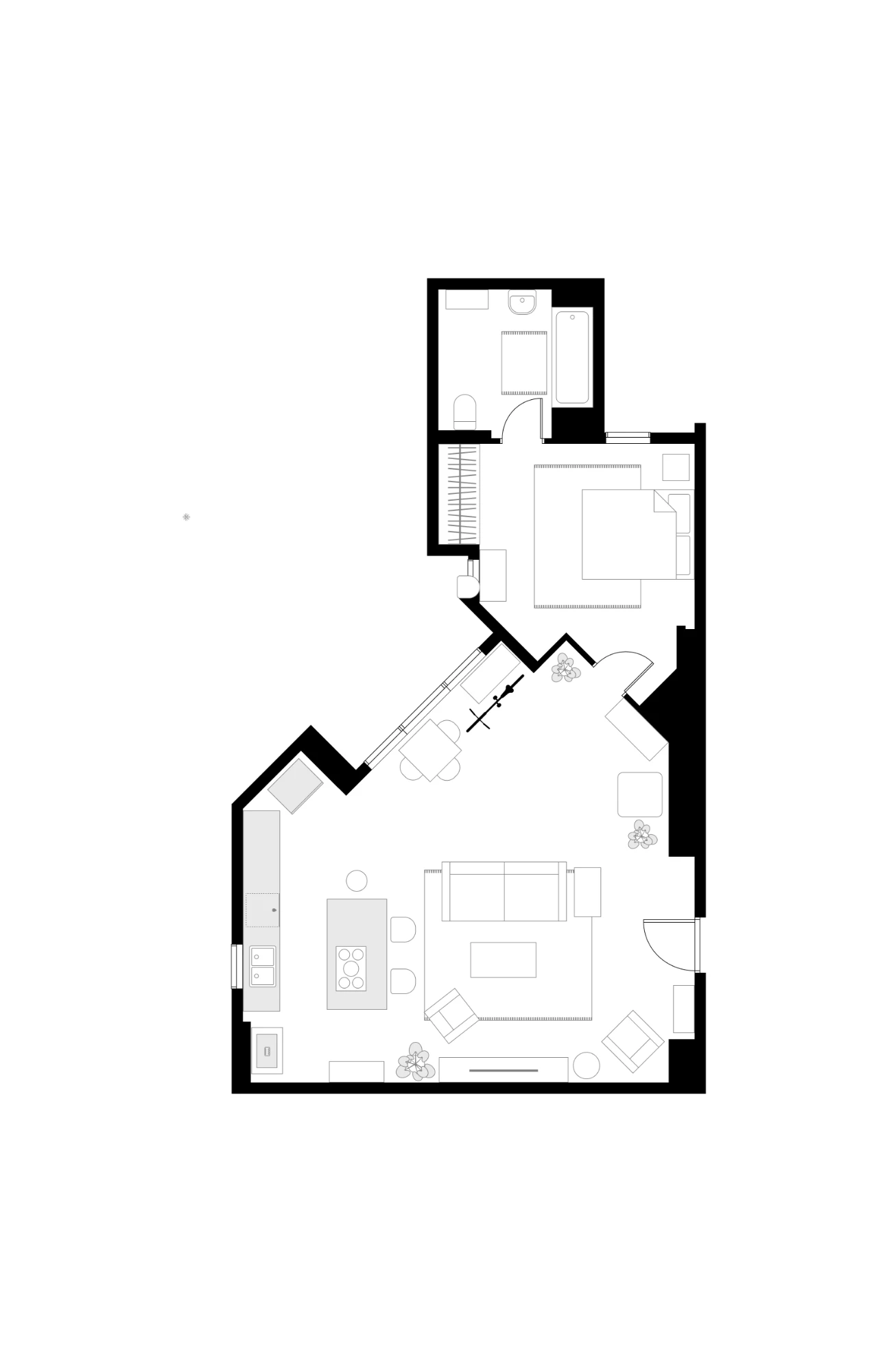
The living end of 4B is not a rectangle. It is a wedge with two cut corners, one diagonal wall across the top and a kink halfway down the left side. Furniture is rectangular. Every sofa, rug, table and media unit you can buy is a rectangle. Put rectangles in a wedge and two things go wrong.
You lose the corners. A corner tighter than 90 degrees will not take a piece of furniture and you cannot walk through it either. It is simply gone. A corner wider than 90 degrees gives you nothing to push against, because a sofa in it only touches at one point.
You lose the axis. Every room has a main line your eye runs along. An angular room has two or three competing ones, so whatever you square the sofa up to, everything else ends up slightly rotated off everything else. Nobody can name that feeling. Everyone gets it.
Classical feng shui has a name for the sharp corners that result: poison arrows (sha qi), corners aimed at where people sit. The honest version, and it is worth being honest here: the research is about preference, not harm. People rate curved rooms and objects as more beautiful than angular ones, fairly reliably, but the same work found they were not actually less willing to walk into an angular room. The corners are not hurting Penny. They are making her flat harder to furnish.
The door opens straight into the living room
There is no entry in 4B. The door swings in and you are standing in the living room holding your bag. In the original layout the first thing in your path is the dining chairs.
Feng shui calls the front door the mouth of qi (气口) and treats the first meter or two inside as setting the tone for the whole home. Plain version: whatever you see and do in the first three seconds is what the place feels like. If those three seconds are “where do I put this, and can I get past this chair”, the apartment reads chaotic no matter how good the sofa is.
The fix is not a wall. A narrow console or a shoe cabinet just inside, clear of the door swing, plus a rug and a light. Keys land, coat lands, eye lands. Rented, screwed to nothing, gone when you move.
The kitchen, and why the short island is the weak point
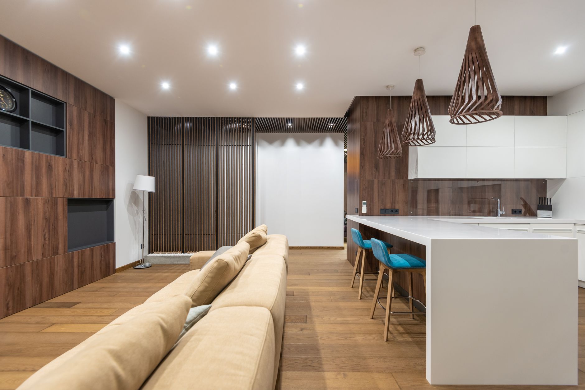
Here is the actual problem with the apartment. The kitchen is a galley run down the left edge: fridge, counter, sink, oven. Then a small island floats next to it with the hob in it. And that island is too short to do anything properly.
Run the real numbers and you can see it fail on all three jobs at once.
- Cooking. The classic work triangle (sink, hob, fridge) wants each leg between 1.2 and 2.7 m, with the three legs adding up to 4.0 to 7.9 m. Penny’s triangle is fine, it is small and tight. The problem is landing space: you want at least 40 cm of counter next to the fridge, 30 cm on both sides of the hob, and 45 to 60 cm beside the sink. A short island with a hob dropped in the middle of it has almost none of that. Nowhere to set a hot pan down.
- Standing. Between an island and the run behind it you want 90 to 120 cm of clear floor. A one cook work aisle is 105 cm, two cooks want 120 cm. That part 4B roughly gets right, which is why the kitchen looks fine on camera.
- Sitting. A stool needs 60 cm of free counter edge per person, and the overhang needs about 30 cm of knee room. A short island with a hob in it has no free edge left. So the stools are decoration.
One feng shui note that is genuinely worth flagging. The hob (fire) sits directly opposite the sink (water) across a narrow aisle. Classical practitioners rate that opposition worse than adjacency, especially under about 2 m apart, because water puts out fire and the stove is read as the household’s wealth and health engine. Modern masters disagree about how much it matters, so treat it as a school specific rule rather than doctrine. The standard cure is to put wood between them, since water feeds wood and wood feeds fire: a runner on the floor, a wooden board standing on the counter, a herb pot. The plain reason to do the same thing: a splash zone and a hot pan zone facing each other across a 1 m aisle is a wet floor and a burn waiting to happen. Both traditions say put something between them. More of this in the kitchen layout guide.
The seating group, and the table nobody can get past
The sofa faces a low media unit across a rug, with a chair on either flank. That is close to right. The numbers to hold it to:
- Facing seats no more than 2.4 to 3 m apart. Past that people raise their voices, and a room where you raise your voice is not a room where you linger.
- Coffee table 40 to 45 cm from the seat edge, about two thirds the length of the sofa, level with the seat or up to 5 cm lower. Never higher.
- Main walkway through the room 90 cm. A secondary path can drop to 60 cm.
- Rug big enough that the front legs of every seat land on it. Sofa on, chairs off is the most common living room mistake there is.
- TV at 1.5 to 2.5 times the screen diagonal, center of the screen 100 to 110 cm off the floor.
Then the round dining table. In the original it sits between the diagonal wall and the kitchen run, right in the only path from the front door to everywhere else. Feng shui likes a round table (no corners, no head of the table, conversation circulates) and so do I, but not here. Dining wants 90 cm from the table edge to pull a chair out and 110 to 120 cm to walk behind someone who is seated. This table has neither. It is anchored to nothing, it blocks the walkway, and in an apartment this size it is the single biggest piece of furniture doing the least work.
The redesign: make the island earn its rent
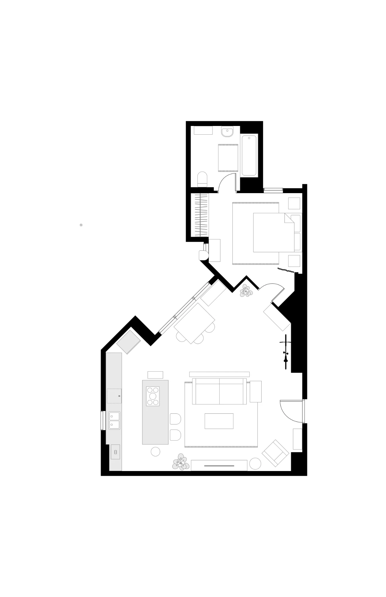
The move is one piece of furniture. Stretch the island.
A longer island fixes the kitchen and the dining problem at the same time, which is the only kind of fix that works in a flat with no spare meters. Keep the hob at the wall end where it has 30 cm of counter on both sides and a clear run to the sink. That leaves the far end free: 120 cm of open edge, two stools, knees under the overhang. Now the island is prep space, a hob, a breakfast bar and the place people lean while you cook, and it costs you the footprint of one long box instead of three separate things.
It also does a job feng shui cares about. Open plans have no containers, so qi either races through the space or puddles in dead corners, and the standard cure is furniture that acts as an implied wall. A long island is exactly that: a solid low boundary between the cooking zone and the living zone that you can still see and talk across. It divides the room without cutting it in half.
Then the table. Push it against the diagonal wall and make it rectangular. The diagonal is the one wall in the apartment that no rectangular sofa will ever sit against, so give it to the table, where a slightly odd angle costs nothing. That clears the whole path from the front door through to the kitchen, which is the walkway that was broken before. Round tables are better tables. A round table in a doorway is not.
The seating group tightens up: sofa, one lounge chair, side table, everything inside conversation distance, front legs on the rug. And a long bench along the bottom wall does storage and overflow seating in one line of furniture that sticks out 40 cm.
The rental version, if you cannot build an island
Almost none of this needs a landlord.
- A freestanding butcher block trolley or a long console at counter height, parked where the island would be. Not as good as built in, and it does 80% of the work.
- Two stools instead of two more dining chairs. A stool tucks fully under. A dining chair never does.
- One rug per zone. Feng shui reads a rug as a room, and so does your brain. Kitchen zone, living zone, that is the whole trick in a studio.
- A pendant over whatever surface you actually eat at, hung 75 to 90 cm above it, diameter about half to two thirds the table width. Light is what tells you a zone is a room.
- A console by the door for the arrival. Keys, mail, lamp.
The honest bit
Moving an island will not change Penny’s luck, and no arrangement of furniture in 4B was going to. What it changes is whether one room can do three jobs without any of them being annoying, which in a flat this size is the entire game.
The feng shui reading and the design reading land in the same place here, which happens more often than either camp admits. Feng shui wants defined zones, a cook who can see the door, clear circulation and nothing dead in the middle of the floor. Interior design wants a 90 cm walkway, 60 cm of counter per person and one piece of furniture that does two jobs. Both of them are telling you to stretch the island and get the table out of the doorway.
Further reading
- The Big Bang Theory · American television sitcom (2007-2019)
- Kitchen work triangle · Concept of an efficient kitchen layout
- Kitchen island · Freestanding countertop or cabinet in the kitchen
- Feng shui · Chinese traditional practice
- Floor plan · Architectural drawing showing interior layout of a building
- Open plan · Floor plan that makes use of large open spaces
- Qi · Vital force in traditional Chinese philosophy
Definitions and background from Wikipedia.
Quick questions
- Is there a real floor plan of Penny's apartment?
- No. There is no official plan of 4B. It was shot on a set with no fourth wall, the geometry shifts between seasons, and doors and windows move when a scene needs them to. Every plan you have seen online, including the good ones, is a fan reconstruction. What reads reliably is the angular shell, the diagonal wall, the galley kitchen and where the door lands, which is what this article works from.
- How long should a kitchen island be if you also want to eat at it?
- Allow 60 cm of counter edge per person, so two stools need about 120 cm of free edge with no sink or hob in the way. Leave 90 to 120 cm of clear floor between the island and the run behind it, and give the overhang about 30 cm of knee room. Below roughly 120 cm long an island cannot really do prep and seating at the same time.
- Can one room work as kitchen, dining and living room?
- Yes, if you stop giving each job its own furniture. The trick is one piece doing two jobs: an island that is also the dining table, a bench that is also storage, a sofa back that is also the wall between zones. Then give each zone its own rug and its own light so the eye can still read three rooms in one space.