Ted's apartment from How I Met Your Mother, redesigned: the angular living room and the conversation pit fix
The short answer: The furniture is not the problem, the shape of the room is. Angled walls kill the corners and the axis, so a rectangular sofa group never sits right. Build the boundary out of the seating instead: a wrapped or sunken conversation pit about 2.5 to 3 m across seats five inside conversation distance, follows the odd angles a sofa cannot, and gives every seat a solid back.
Ted and Marshall’s apartment is one of the most looked at living rooms in sitcom history, and the living area is the part that never quite works. It is not the furniture. It is the shape of the room. The walls do not meet at right angles, the kitchen cuts in on a diagonal, and every piece of furniture in there is a rectangle trying to make peace with a wedge.
Before anything else: there is no official floor plan. It was shot on a set, the geometry shifts between seasons, and doorways move when a scene needs them to. Every plan you have seen online is a fan reconstruction. So this is not a survey of a real apartment. It is a read of what the camera consistently shows, and the fixes apply to any real room with the same problem: an open living area with angled walls and nowhere obvious to put a sofa. Same exercise we ran on the Friends apartment teardown.
What the apartment already gets right
Plenty, actually.
Light. Big windows on the main wall. Light is the one thing feng shui and sleep science agree on completely: qi is said to enter with light, and daylight exposure is the strongest evidence backed lever in the whole home. The apartment has it.
One gathering room. Five people’s entire social life happens in one space, and the place is honest about that. No formal room nobody uses.
The kitchen faces the room. Because the kitchen is open to the living area, whoever is cooking looks out at everybody instead of at a wall. Feng shui calls that the commanding position, and treats a cook with their back to the door as a real problem. Most kitchens fail this. This one passes by accident.
It looks lived in. Things have accumulated, nothing is styled. Rooms people actually use read warmer than rooms that photograph well.
The angular living area, and why odd angles fight furniture
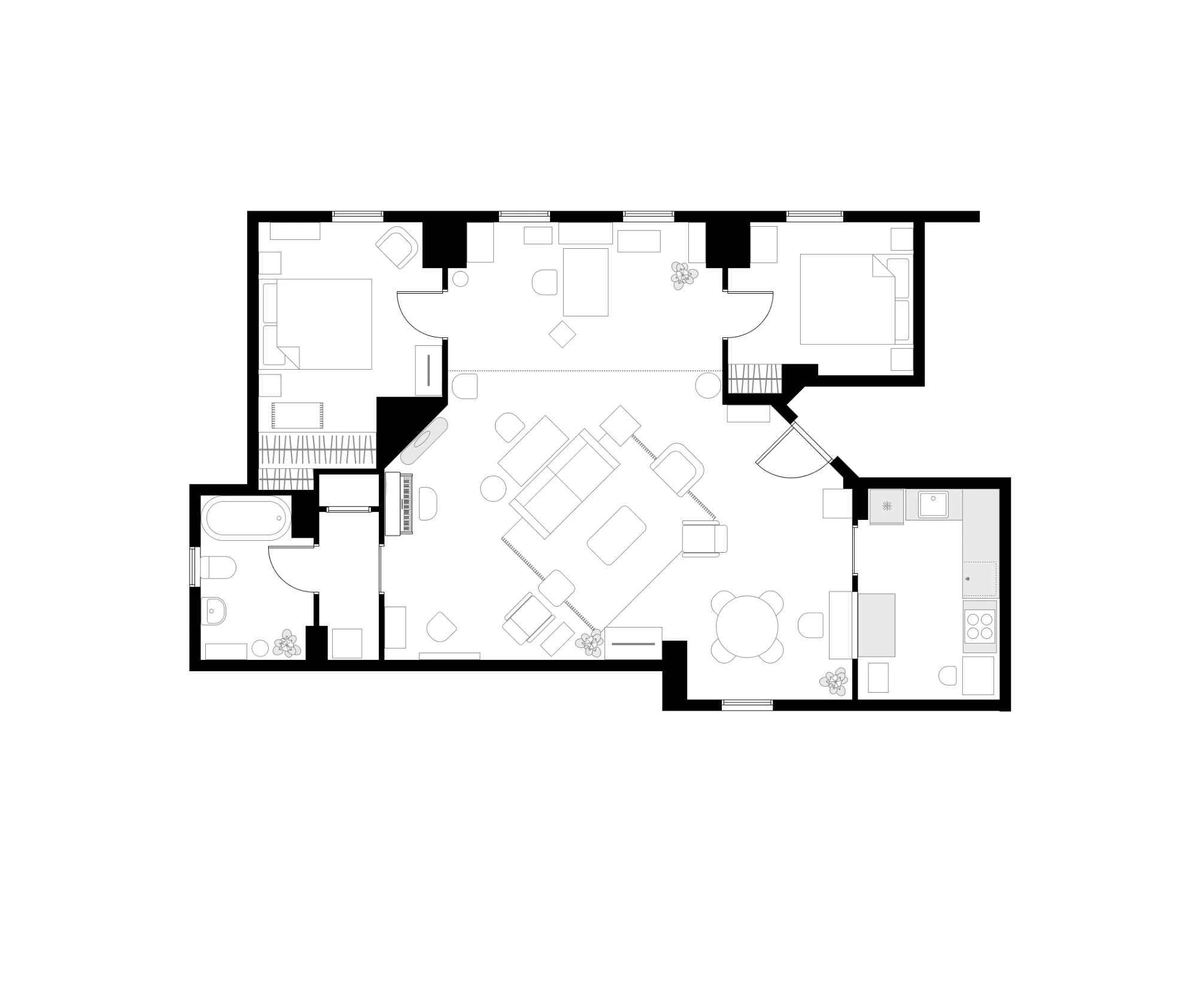
Now the problem. The living zone is not a rectangle. It reads as a wedge, with the kitchen cutting across one edge and walls meeting at angles that are not 90 degrees.
Furniture is rectangular. Sofas, rugs, coffee tables, TV consoles: all rectangles. Put a rectangle against a wall that is not parallel to any other wall and three things go wrong at once.
You lose the corners. A corner tighter than 90 degrees will not take a piece of furniture, and you cannot walk through it either. It is just gone. A corner wider than 90 degrees gives you nothing to anchor to, because a sofa pushed into it only touches at one point.
You lose the axis. Every room has a main line your eye follows. An angled room has two or three competing ones, so whichever wall you commit the sofa to, everything else ends up slightly rotated off everything else. Nobody can name that problem. Everyone feels it.
You get corners aimed at people. Classical feng shui calls a sharp corner pointing into the room a poison arrow (sha qi). The honest version: the research here is about preference, not harm. People reliably rate curved rooms and objects as more beautiful than angular ones, and sharp forms mildly trip the brain’s threat detection, but the same studies found people were not actually less willing to walk into an angular room. The corners are not hurting anyone. They are just making the room harder to like.
The seating never adds up for five people

The group is five. A three seat sofa plus one chair does not seat five, and the show quietly works around it: someone stands, someone leans on the counter, someone sits on the arm.
The number to hold onto: facing seats want to be no more than 2.4 to 3 m apart. Past that people raise their voices, and a room where you raise your voice is not a room where you linger. Under about 1 m it turns intimate, which is fine for two and strange for five. So a real conversation group for five means five actual seats, all inside that band from each other, which works out to a circle roughly 3 m across.
Then the supporting numbers, standard design practice rather than feng shui:
- Coffee table 40 to 45 cm from the seat edge: reachable sitting down, walkable without banging a knee.
- Coffee table about two thirds the length of the sofa, and level with the seat or up to 5 cm lower. Never higher.
- Main walkway through the room 90 cm. A secondary path can drop to 60 cm.
- A rug big enough that the front legs of every seat land on it. Sofa on, chairs off is the most common living room mistake there is.
- TV at 1.5 to 2.5 times the screen diagonal, center of the screen 100 to 110 cm off the floor.
Feng shui adds one: a round or oval coffee table, so no corner points at a seated person. In an already angular room, that is worth doing for the contrast alone.
The door opens straight into the room
There is no entry. The door opens and you are in the living space, so the first thing anyone does on arrival is stand in the middle of the room holding their coat.
Feng shui calls the front door the mouth of qi (气口) and treats the first meter or two inside as setting the tone for the whole home. Plain version: whatever you see and do in the first three seconds is what the place feels like. If those three seconds are “where do I put this”, the apartment feels chaotic no matter how good the sofa is.
The fix is not a wall. A narrow console or a shoe cabinet just inside, clear of the door swing, plus a rug and a light. Keys land, coats land, the eye lands. And if the door lines up with a window straight across the room, that line is what classical practitioners call a piercing hall (穿堂煞, chuan tang sha), where qi shoots in and straight back out. The same console breaks it.
The bar counter, and the kitchen on show
The counter between kitchen and living area is the best piece of the apartment. It is where people lean, it is where drinks get made, and it does the job of a wall without being one.
Two things to sharpen. Size it as a real eating spot: 60 cm of counter edge per person, and 90 to 120 cm of clear floor between the counter and the run behind it, so a cook and a leaner are not in each other’s way. Any pendant over it hangs 75 to 90 cm above the counter, high enough to see across.
Then the kitchen being on show from the door. Classical feng shui does not like that: wealth (the stove) exposed to the entrance is read as leaking, and there is an old line about guests who eat and leave. The plain version is less mystical, and it is the same point: the first thing you see on arrival is last night’s dishes. You cannot move a kitchen. You can arrange the arrival path so the counter, not the sink, is what you see first.
The fix: a conversation pit
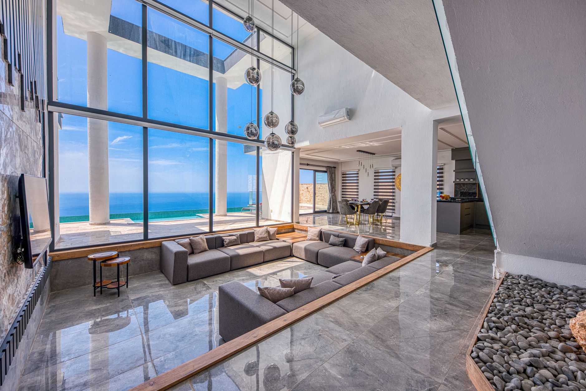
Here is the move this room is asking for. Stop trying to build a rectangular living room inside a wedge, and build a defined seating zone instead.
A conversation pit is a real design device, not a gimmick. It came out of mid century architecture, the most famous being the sunken pit in Eero Saarinen’s Miller House with interiors by Alexander Girard. The floor drops a step, seating wraps the perimeter, and you get a room inside a room with no walls involved.
That is precisely the problem here. This apartment has no good walls to anchor a sofa to, so stop borrowing walls and make the boundary out of the seating itself. Wrapped seating handles the angles too, which a sofa never can: a built in bench follows whatever line the wall is on. The wedge corner that would not take an armchair becomes a corner seat. The angle stops being leftover space and becomes the shape of the furniture.
Sizing it: keep the inside of the pit around 2.5 to 3 m across so facing seats stay in conversation range, and put a low round table in the middle, 40 to 45 cm from the seat edges and level with the seat height. Five people fit easily. Eight fit if everyone shuffles up.
Renting, or not owning a saw? Skip the sunken floor and keep the wrap. A continuous L or U of low modular seating built to follow the walls gets you nearly all of it: the defined zone, the shared table, everyone facing in. A sunken pit is permanent, a trip hazard, and a nightmare at resale. The wrapped version is just furniture. We walk through the same zoning logic, minus the wedge, in the living room layout guide.
What feng shui makes of a pit
There is no classical rule about conversation pits. Feng shui is roughly three thousand years older than they are. So read it against the principles that do exist.
Three things it does well. Every seat gets a solid back, which is the refuge half of commanding position and the strongest overlap between feng shui and environmental psychology in the whole system. Everyone can see the entrance, which is the prospect half. And the arrangement is roughly circular, which is exactly what the living room rules ask for: seating grouped for conversation, so qi and the conversation both keep circulating instead of dead ending at a TV.
One thing to watch. A pit points inward by design. Here that is a feature, because the room’s job is five people talking. In a home where the living room is also the walk through route to everywhere else, a pit puts a hole in the middle of your circulation, and feng shui is consistent that circulation is what keeps a room alive. Check your paths before you cut anything.
The honest note to close on: sinking a floor will not change your luck. It will change whether five people can sit in one room and talk without somebody perching on an armrest. For a home built entirely around that, it is the right call.
The apartment, after
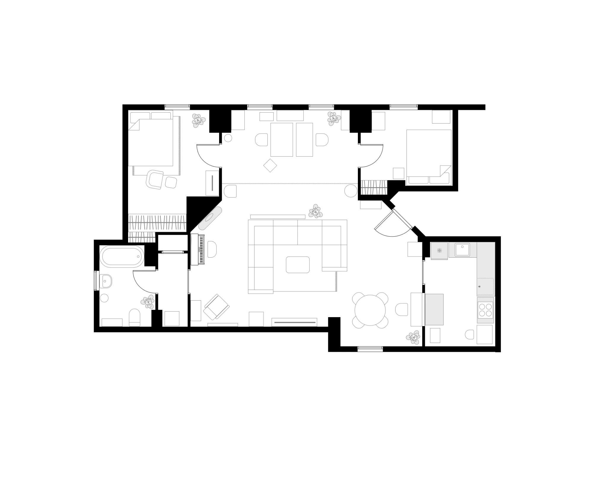
The wedge stops being a problem and becomes the seating plan. A wrapped pit anchors the middle of the room, five people sit inside conversation distance for the first time, the counter reads as a proper bar with room to lean, and a console by the door finally gives arrivals somewhere to land. Nothing structural, unless you want the step.
Further reading
- How I Met Your Mother · American sitcom (2005-2014)
- Conversation pit · Architectural feature
- Feng shui · Chinese traditional practice
- Living room · Room in a residential house for relaxing and socializing
- Floor plan · Architectural drawing showing interior layout of a building
- Qi · Vital force in traditional Chinese philosophy
- Eero Saarinen · American architect (1910-1961)
Definitions and background from Wikipedia.
Quick questions
- Is there a real floor plan of Ted's apartment?
- No. There is no official plan. It was shot on a set with no fourth wall, the geometry shifts between seasons, and doors and windows move when a scene needs them to. Every floor plan online is a fan reconstruction, including the good ones. What you can read reliably is the shape of the living zone and how the furniture sits in it, which is what this article works from.
- What is a conversation pit?
- A seating area sunk a step below the surrounding floor, with benches wrapping the perimeter and a low table in the middle. It is a mid century design device, the most famous example being the pit in Eero Saarinen's Miller House with interiors by Alexander Girard. The point is that it defines a room without using any walls, which is why it keeps coming back in open plan homes.
- How do you lay out a living room with angled walls?
- Stop trying to fit rectangles. Angled walls kill the corners (too tight to use, too open to anchor to) and give you two or three competing axes. Built in or modular seating that follows the wall line absorbs the angle instead of fighting it, and turns dead wedges into corner seats. Then define the zone with the seating itself plus a rug, rather than borrowing walls you do not have.