Ross Geller's apartment from Friends, redesigned: two round tables and no dining room
The short answer: The bones are good: two bedrooms, a real hall, a kitchen with a door. The living room is the weak part. The dining table is pushed into the corner against the window wall, where you cannot pull out half the chairs, and the sofa floats in the middle squared to nothing. Pull the table into the room, square the sofa to a long media wall on a rug, and one vague room becomes a dining zone and a living zone.
Ross gets the most house of anyone in Friends. Two bedrooms, a hall with doors off it, a kitchen you can shut, a bathroom with a tub. Monica has one big room with a bed at the far end, and Penny’s apartment over in Pasadena is one room doing three jobs at once. Ross has actual rooms, and his living space is still the vaguest of the three. That is the interesting part, and it is the version most people with a decent sized flat are living in: enough space, no decision about what the space is for.
One thing plainly, up front. Sitcom sets have inconsistent geometry and there is no official floor plan. Walls move when a scene needs them to. So this is a reading of a fan known layout, not a survey. It still holds, because the problem is generic: a big room, a window wall, a door in the corner, and a middle that nobody assigned a job to. The companion piece is the Monica and Rachel teardown, same building, opposite problem.
What the apartment gets right
Sleeping and living are genuinely separated. Two bedrooms sit across the top of the plan behind a short hall, and the living space hangs below. Feng shui’s whole complaint about studios is that yin (sleep) and yang (cooking, talking, TV) share one volume, so rest never fully switches off. Ross has a hall doing that work. A hall is an airlock, and people underrate them until they live without one.
Both beds have solid wall behind them and can see their door. That is the commanding position, and it is the strongest overlap between feng shui and environmental psychology in the whole system. People reliably choose wall backed, door facing seats when you give them the option.
The kitchen is a room, not a wall of the living room. It has a door and a corner of its own, so you can leave dishes in it and close it. Open plan looks better in photos and this is nicer to live in.
The living space gets a window wall on the long side, so light comes in across the length of the room instead of down one end. Best thing about the layout, and the original arrangement barely uses it.
Two round tables, and no dining room
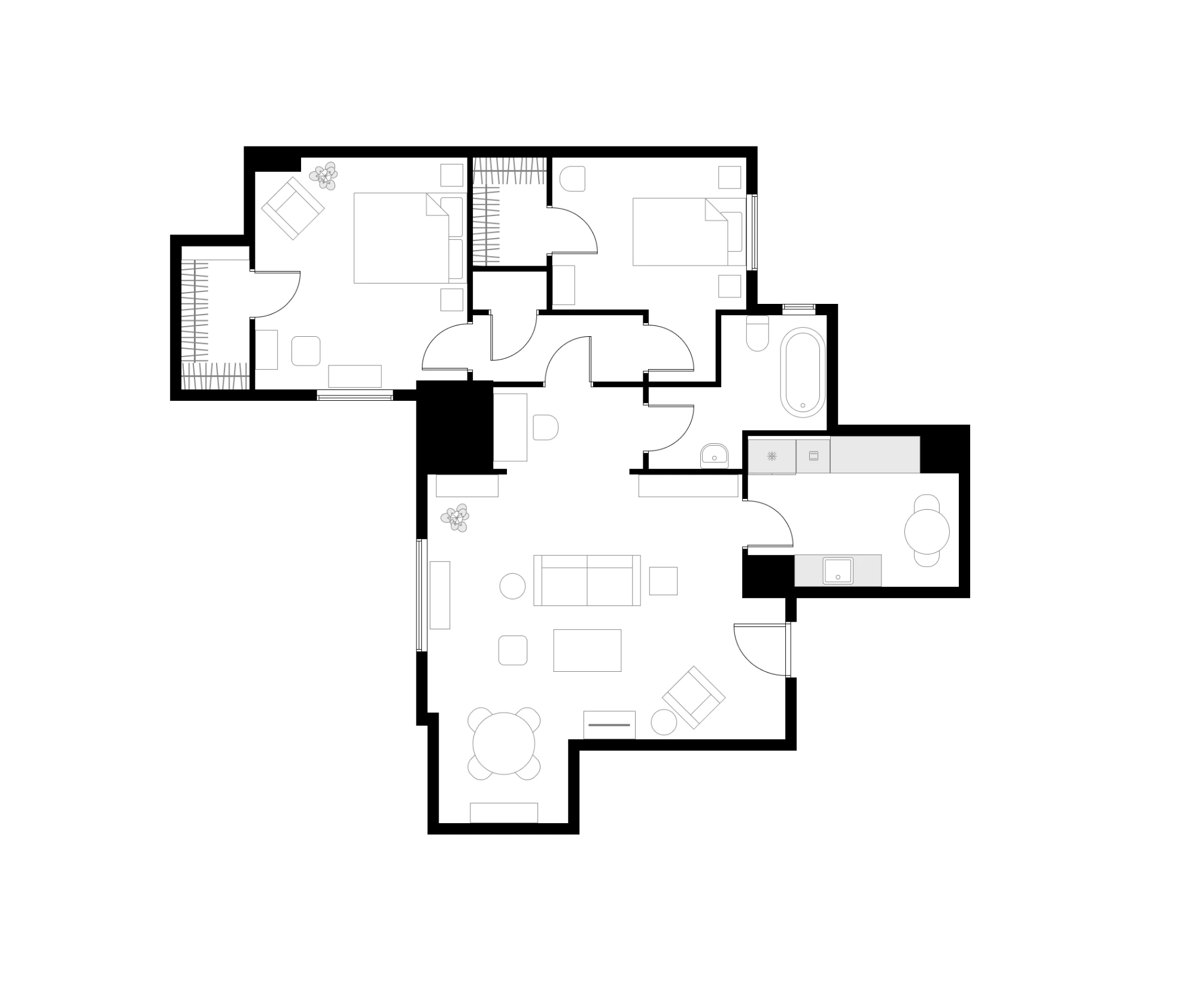
Look at the plan and count the tables. There is a small round one tucked into the far corner of the galley kitchen. There is another round one down in the bottom left corner of the living space, jammed against the window wall. Two tables, four chairs each, and nowhere that reads as a dining room. That is the whole diagnosis. The apartment did not run out of space, it ran out of decisions, so eating got split across two leftovers.
The kitchen table is the more forgivable one. A galley is a work run: fridge, counter, sink, stove, in a line. A galley wants a clear work aisle of 105 cm for one cook and 120 cm for two, and a table with chairs around it is not a clear aisle, it is four chair backs waiting to be walked into. The living room table is the real problem, and it is a different failure from Monica’s floating table across the hall. Hers has no zone at all. Ross’s has a corner, which feels like an answer and is not one.
What a dining zone actually needs
Run the numbers on a table pushed into a corner against a window wall and you can watch it fail.
- 60 cm of table edge per person. That part a small round table can do for four.
- 90 cm from the table edge to any wall or furniture, so a chair can pull out at all. In a corner, two of the four sides are wall. Those chairs come out sideways or not at all.
- 110 to 120 cm to walk behind someone who is seated. In the corner you get that on one side, maybe.
- A rug under the table needs to run 60 to 75 cm past the edge on every side, or chair legs drop off it when pulled out. Impossible against two walls.
- A pendant 75 to 90 cm above the tabletop, diameter about half to two thirds the table width. There is no light over a corner. There is a window over a corner.
So of the five things that turn a table into a dining zone, a corner table gets one. It is a table you can technically sit at and never a room you would host in.
Feng shui likes round tables, and rightly: no corners aimed at anyone, no head of the table, conversation circles instead of running down a line. It also wants an even number of matching chairs, because an odd lonely chair reads as somebody missing. Ross passes both. Neither helps, because both are rules about the table and his problem is the table’s address.
One classical idea gets misread here a lot. The bright hall (明堂, ming tang) is the open space in front of the main door, and it should stay clear and light. People turn that into “push everything to the walls”. It does not say that, and a room where every object hugs a wall reads like a waiting area. Clear is not the same as empty. The middle should have a job.
The sofa is squared to nothing
The sofa sits fairly central, facing down the room at a low media unit, with small tables scattered near it and an armchair off near the front door. It is not obviously wrong on camera. On the plan you can see what is missing: nothing is behind it. Feng shui wants a solid wall behind the main seat, the “mountain”, the same backing logic as the headboard rule. Plain version: an open floor behind your head where people walk is the seat nobody in a cafe picks. If you genuinely want the sofa off the wall, the standard cure is a console or a low bookcase along its back, because it gives your body an edge to read.
The bigger issue is alignment. Every room has one main line your eye runs along, and in a long room with a window wall that line is obvious. This sofa is not on it, so the seating, the media unit and the window wall all argue slightly.
The numbers that hold a seating group together, all of which this arrangement misses by a bit:
- Facing seats no more than 2.4 to 3 m apart. Past that people raise their voices, and nobody lingers in a room where they have to project.
- Coffee table 40 to 45 cm from the seat edge, about two thirds the sofa length, level with the seat or up to 5 cm lower, never higher.
- TV at 1.5 to 2.5 times the screen diagonal, with the center of the screen 100 to 110 cm off the floor. A media unit floating a long way down an open room puts you at the wrong end of that.
- Rug big enough that the front legs of every seat land on it, and 30 to 45 cm of bare floor between rug and wall. Sofa on, chairs off is the most common living room mistake there is. More on all of this in the living room layout guide.
Getting from the front door to the bedrooms
The front door opens into the bottom right corner of the living space. From there, everything you do in this apartment crosses the room: kitchen up the right side, bathroom and hall up the middle, bedrooms beyond that. The main traffic route runs diagonally across the living zone.
Feng shui calls the front door the mouth of qi (气口) and treats the first meter or two inside as the tone setter for the whole home. Easy to translate: whatever you see and do in the first three seconds is what the place feels like. In the original there is an armchair sitting right in that landing spot, doing no work for anyone, exactly where you want to put a bag down. The design rule underneath is simpler. A main walkway needs 90 cm clear, a secondary path can drop to 60 cm, and door swings stay empty. The seating group should sit beside the route, not straddle it. Right now the sofa is close enough to the middle that people cut past its back, which is exactly what makes a floating sofa feel exposed.
The fix is not a wall. It is a narrow console or a shoe cabinet just inside the door, clear of the swing, plus a rug and a lamp. Keys land, coat lands, eye lands, and the walking line gets a defined edge instead of drifting into the living zone.
The sleeping wing and the living wing
Four doors fan off a short hall: two bedrooms, the bathroom, and the way back out to the living space. Classical practitioners call two doors facing each other across a narrow space a door clash (门冲) and read it as a spot where energy collides. The plain version is the same: doors that swing at each other, no wall left to hang anything on, and a bathroom door opening within earshot of a bed. None of that needs building work. Keep the bathroom door shut (feng shui’s most repeated habit, and the mundane version is noise and damp), stagger two lights down the hall instead of one overhead, and put a runner on the floor so the hall reads as a room you pass through rather than a chute.
What the hall really does is why this apartment beats the others in the show: the living zone is allowed to be loud, because there is a closed door between the noise and a sleeping kid. That separation is the luxury here, and the redesign should protect it, not borrow from it.
The redesign: pull the table in, give the sofa a wall
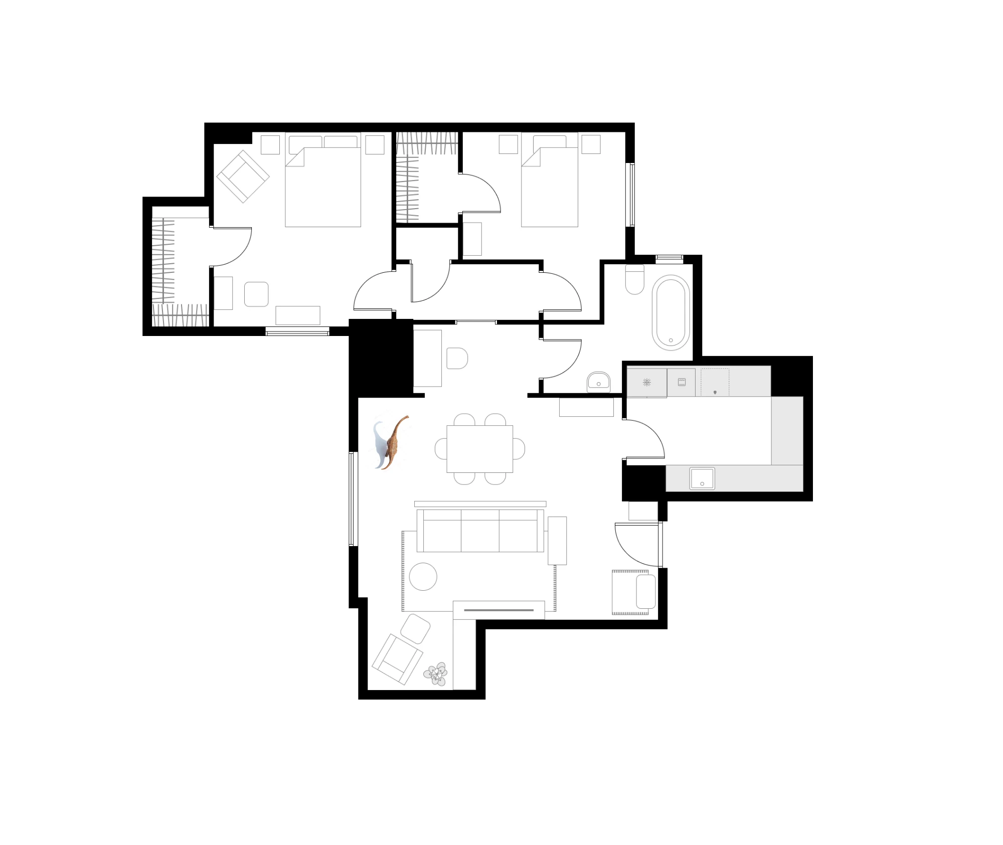
Two moves, and they are the same move twice: commit.
Pull the table into the room. A rectangular six seater goes in the upper half of the open space, directly below the hall, standing free with clearance on all four sides. Now every chair pulls out, you can walk behind seated people, a rug can run past the edges, and there is ceiling above it for a pendant. Six seats instead of four, in less awkward space than the corner version. The kitchen table goes, which hands the galley back its work aisle.
Square the sofa to a long media wall. It moves down and lines up with the wall at the bottom of the room, on a rug, with a side chair and a round side table beside it. Now the seating has backing, a real axis, a sensible TV distance and a rug that catches the front legs of everything. A lounge chair and footstool with a plant take the bottom left corner, which is what a corner is actually good for: one comfortable seat, not four cramped ones.
That gives you two zones instead of one fog. Eat at the top, sit at the bottom, walking route from the front door between them instead of through either. Open plans have no containers, which is feng shui’s real objection to them, and the standard cure is furniture acting as an implied wall. A table with air around it and a sofa back facing the room do exactly that. You can see across both. You cannot wander through either.
And yes, there is a dinosaur standing in the living area on that plan. Ross is a paleontologist, so it is a joke. It is also the honest proof: the reason a full sized model fits in that spot is that the new arrangement actually clears that much floor. The furniture did not just move, the room gained usable middle.
The rental version
Nothing here needs a landlord.
- Move the table first. It costs nothing and it is the change you will feel walking in.
- One rug per zone. Feng shui reads a rug as a room and so does your brain. Dining rug, living rug, done.
- A light over the table, hung 75 to 90 cm above the top. A plug in cord set on a ceiling hook counts. Light is what tells you a zone is a room.
- A console or low bookcase behind the sofa if the wall is not available: a mountain, a place for lamps, and a landing spot by the door if you put one there too.
- One good chair in the corner beats four bad ones. Corners are for lounging, not dining.
The honest bit
Rearranging this apartment would not have fixed Ross’s decade. No layout was going to. What it fixes is smaller and real: whether a big room can hold six people at dinner and four people on a sofa without either group standing in the other’s way. Feng shui wants clear circulation, defined zones, backing behind the main seat and nothing dead in the middle of the floor. Interior design wants 90 cm around a table, 90 cm through a room, a rug that catches the front legs and one clear axis. Both of them are telling you the same thing here: get the table out of the corner, and give the sofa a wall to mean something.
Further reading
- Friends · American television sitcom (1994-2004)
- Feng shui · Chinese traditional practice
- Floor plan · Architectural drawing showing interior layout of a building
- Living room · Room in a residential house for relaxing and socializing
- Dining room · Room dedicated to consuming food
- Paleontology · Study of past life through fossils
- Qi · Vital force in traditional Chinese philosophy
Definitions and background from Wikipedia.
Quick questions
- Is there a real floor plan of Ross's apartment in Friends?
- No. There is no official plan. Friends was shot on sets with no fourth wall and famously loose geometry, so walls, doors and windows shift between seasons and between episodes. Every plan you have seen online is a fan reconstruction. What reads consistently is the shape: a sleeping wing of two bedrooms off a short hall, a bathroom and a galley kitchen down one side, and one open living and dining space below it. That is what this article works from.
- How much clearance does a dining table need on every side?
- Allow 90 cm from the table edge to the nearest wall or furniture so a chair can pull out, and 110 to 120 cm if people need to walk behind someone who is seated. Each person needs 60 cm of table edge. If the rug sits under the table it should run 60 to 75 cm past the edge on all sides, so chair back legs stay on it when pulled out.
- Can a sofa float in the middle of a room?
- Yes, if it gets something solid behind it. A floating sofa with open floor at its back reads as exposed, which is why feng shui wants a wall (the mountain) behind the seat and why people pick wall backed seats in restaurants. The standard fix is a console table or a low bookcase along the sofa back. What kills a floating sofa is not the floating, it is being squared to nothing: pick one long wall and line it up with that.